With the Major League Baseball trade deadline approaching, I am hoping that my team, the Los Angeles Dodgers, don't - if you'll excuse the pun, bet the farm on some overpaid player another team wants to dump. As far as I'm concerned, Chad Billingsly, Joe Beimel, Jonathan Broxton, James Loney, Matt Kemp, Tony Abreu, Russell Martin, and Andre Ethier should be untouchable. Chances are one or two of these guys is going to be big stars, some are going to be solid players, and one or two may fizzle out into busts. The thing is that no one really knows who's going to end up being what.
This year is probably not our year. Let's give these guys more games to work together and hopefully make the playoffs. Then look out next year.
Sunday, July 29, 2007
Politics vs Science (A Convenient Lie Part 6 - FINAL)
 Science
It takes very little in overall temperature change to melt glaciers and show the environmental impact that global warming alarmists love to show. An overall increase in solar radiation over the past 2 centuries certainly accounts for the 1 degree rise in temperature we've experienced. 250 years ago, we had a cold period known as the "Little Ice Age". 1,000 years ago, we had the "Medieval Warm Period", a very warm period where there is evidence that the northern polar ice caps were melted. Why do you think Greenland is called "Greenland"? The Vikings named it that a millennium ago because it was an expanse of green, grassy prairie in their time.
We spew all sorts of gunk into the air. The hazardous effects of pollutants such as sulphur dioxide (SO2) and carbon monoxide (CO) are well documented. Air pollutants cause health problems such as asthma and lung cancer. Air pollution leads to acid rain which means these pollutants are getting into the ground and causing even more problems. We are poisoning fish (and ultimately, ourselves) by dumping lead and mercury into the rivers and oceans. These problems are man-made and they are real.We should be addressing real issues, not chasing shadows. Also, note that people talking about global warming as real are politicians, not scientists - political organizations, not scientific ones. The Sierra Club sure believes in it. Check out Scientific American. The most respected public scientific journal/magazine is very neutral about the whole thing.
Politics
Democrats are doing their best to pin global warming on Republicans. Even though this pseudo-junk-science phenomenon, which, even by their own admission has been going on for decades, they are trying like crazy to blame it all on one George W. Bush. Their argument for this? - Because George W. Bush refused to ratify the Kyoto Treaty.
The Treaty of Anti-American Industry - aka Kyoto Treaty was essentially designed to benefit every nation on Earth except the United States. European nations, on the whole, don't have much heavy industry. Their small roads, high fuel prices have by economics, forced Europeans to get by with small, highly fuel efficient cars. They get much of their steel and other processed materials from South America, Africa, and parts of Asia that are not part of the Kyoto accord. So to them, the treaty was a slam dunk. They got to look good to their citizenry and wouldn't be very affected economically. American industry, on the other hand, would have been slapped with tons of new regulations and restrictions. Enough where what remaining industrial jobs would go to China.
China Overtakes U.S. as World's Biggest CO2 Emitter
Do you think China, perhaps, has an interest in the U.S. shutting down more industries?
Another Angle
The theory of man-made (anthropogenic) global warming is highly suspect. The whole global warming theory - man-made or not is not even universally accepted as the southern hemisphere of the Earth has actually been cooling. (The alarmists conveniently don't mention this.)
But, even if it was true! Even if the alarmists are right, they are still not telling us everything. Increased CO2 in the air has benefits. In case you didn't know, plants breathe Carbon Dioxide. Increased levels of CO2 means flora, on the whole, thrive. Plankton, the lowest link in the food chain, multiply. This is good news. Global cooling would be a much bigger problem. Witness the little ice age 250 years ago when much of Europe was starving due to low crop yields and a scarcity of fish.
Either way, human beings adapt. Let's get back to real problems like terrorism and real (non CO2) pollution.
Sunday, July 22, 2007
The Truth (A Convenient Lie Part 5)
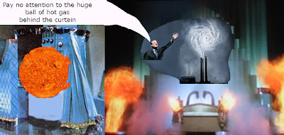
If I had just crawled out of a cave and I was told that temperatures were rising, I'm pretty sure the first thing I would think of is the Sun. Call me crazy, call me hopelessly naive, but I tend to look for straightforward, even obvious answers to problems. Neither the IPCC nor Al Gore seem to want to do this, however. Instead, they came up with a contrived, complicated reason. Now of course, Climate Science is complicated, Gore used this to put on his smoke and mirrors act. To do this, he hardly mentions the Sun at all. The only time he really does is when he talks about how greenhouse gases trap it. The IPCC and Gore treat sunlight as some sort of universal constant.
The Sun has Weather too
Sunshine is not a constant. It varies year to year. One of the ways we track it is by sunspot activity. Essentially, the more sunspots, the more magnetically active the Sun is. The more magnetically active the Sun, the more energy it spews. We've been tracking sunspots since the 1600's - Galileo was the first to discover them in 1610. NASA has been collecting data on them.
 I think the chart above speaks for itself.
Still don't believe?
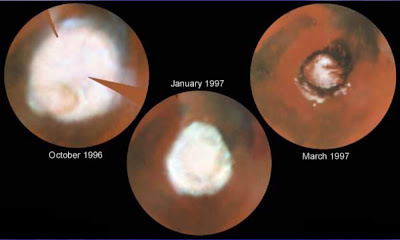
Mars has shrinking ice caps. We've known about them since 1671 (Huygens). Between then and now, there has never been a time where they are so small. In fact, at the rate they are shrinking, they might be completely gone in a few decades - much the same way the northern ice cap on Earth may disappear soon.
Are the Martians burning fossil fuels?
Sunday, July 15, 2007
Why It's Wrong (A Convenient Lie Part 4)
At the risk of being repetitive, let me summarize the entire global warming argument.
The Carbon Dioxide - Temperature Correlation
Let's look at the CO2 graph. This graph is based on the IPCC argument that CO2 levels are rising and are at record levels.
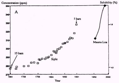
Notice anything unusual about this graph? One is the gap from 1900 to 1986. Why is there no data for these years?
Also, the data up until 1950 came from ice core samples taken in the Arctic. From 1986 on, the data comes from direct readings from the 13,000 ft Mauna Loa volcano in Hawaii. That in itself is pretty interesting isn't it? To anyone who's not so eager to just swallow this graph up and accept it as "truth", it leads to the question; Why did they use two different types of data for two different time periods?
Let's look at another graph.
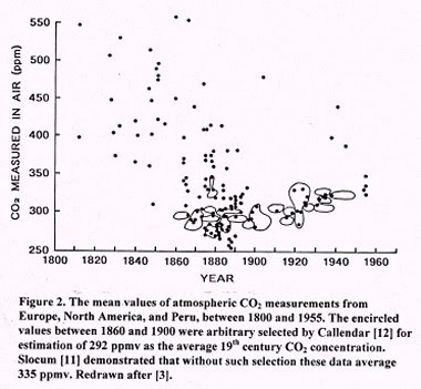
This is a graph showing CO2 levels up until 1960. The difference between this and the previous one is that this data comes from direct sampling from the Pacific. Notice how the CO2 levels are actually much higher in the 1800's. Also notice how some samples are at around 500 parts per million (ppm). In An Inconvenient Truth, Al Gore specifically states that CO2 levels have never reached above 300 ppm until now.
For a full explanation of these graphs, look at this article.
Now let's take a look at the whole Carbon Dioxide - Global Temperature correlation. Here is a frame taken directly from An Inconvenient Truth:

This is from the part of the film where Gore is comparing global levels of CO2 (red) to global temperatures (white). Gore expects you to see this and immediately see the correlation that in general, when CO2 levels are high, so is the temperature. Now keep in mind that this shot is taken right from the movie. I'm going to show you something I'm sure Gore did not intend for you to see.
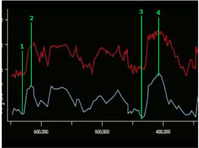
I drew in some vertical lines. You may have to click on the image to see my point here. Notice how as the lines show, temperatures change first, CO2 levels change later. In line #1, the white line is bottomed out. Notice the CO2 level has not bottomed out at this point. It's following the same general pattern as the temperature but seems to lag behind it. Line #2 is an example where the temperature has peaked, yet the CO2 is still rising. What does this graph show? It shows that temperature increases and decreases affect CO2 levels, not the other way around. In other words, raise the temperature and eventually, the CO2 level will rise. Al Gore and the IPCC want you to believe that changing the CO2 levels change the temperature. Gore's own graph contradicts this claim. I'll concede that not every single peak and valley indicate this, but look at the chart, most of them do.

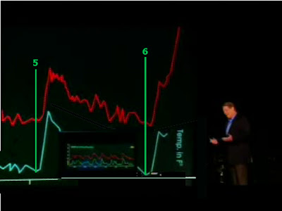
Above is more of the same. This time, we're at the end of the chart (where Gore goes up in a crane to demonstrate the "off the chart" CO2 levels we're going to reach in 50 years or less). Even here, where the temperature and CO2 levels are rising as Gore strongly emphasizes, my point shows again. Look at line 6 where we have the current temperature/CO2 rise, the temperature began rising before the CO2 levels.
Al Gore is lying.
- -There has been an increase in Carbon Dioxide (CO2) in the atmosphere over the past 150 years.
- -Global temperatures have risen over the same period of time.
- -From the two facts listed above, we can conclude that global warming is caused by human beings spewing CO2 since the Industrial Revolution has occurred over approximately the same period of time.
The Carbon Dioxide - Temperature Correlation
Let's look at the CO2 graph. This graph is based on the IPCC argument that CO2 levels are rising and are at record levels.

Notice anything unusual about this graph? One is the gap from 1900 to 1986. Why is there no data for these years?
Also, the data up until 1950 came from ice core samples taken in the Arctic. From 1986 on, the data comes from direct readings from the 13,000 ft Mauna Loa volcano in Hawaii. That in itself is pretty interesting isn't it? To anyone who's not so eager to just swallow this graph up and accept it as "truth", it leads to the question; Why did they use two different types of data for two different time periods?
Let's look at another graph.

This is a graph showing CO2 levels up until 1960. The difference between this and the previous one is that this data comes from direct sampling from the Pacific. Notice how the CO2 levels are actually much higher in the 1800's. Also notice how some samples are at around 500 parts per million (ppm). In An Inconvenient Truth, Al Gore specifically states that CO2 levels have never reached above 300 ppm until now.
For a full explanation of these graphs, look at this article.
Now let's take a look at the whole Carbon Dioxide - Global Temperature correlation. Here is a frame taken directly from An Inconvenient Truth:

This is from the part of the film where Gore is comparing global levels of CO2 (red) to global temperatures (white). Gore expects you to see this and immediately see the correlation that in general, when CO2 levels are high, so is the temperature. Now keep in mind that this shot is taken right from the movie. I'm going to show you something I'm sure Gore did not intend for you to see.

I drew in some vertical lines. You may have to click on the image to see my point here. Notice how as the lines show, temperatures change first, CO2 levels change later. In line #1, the white line is bottomed out. Notice the CO2 level has not bottomed out at this point. It's following the same general pattern as the temperature but seems to lag behind it. Line #2 is an example where the temperature has peaked, yet the CO2 is still rising. What does this graph show? It shows that temperature increases and decreases affect CO2 levels, not the other way around. In other words, raise the temperature and eventually, the CO2 level will rise. Al Gore and the IPCC want you to believe that changing the CO2 levels change the temperature. Gore's own graph contradicts this claim. I'll concede that not every single peak and valley indicate this, but look at the chart, most of them do.


Above is more of the same. This time, we're at the end of the chart (where Gore goes up in a crane to demonstrate the "off the chart" CO2 levels we're going to reach in 50 years or less). Even here, where the temperature and CO2 levels are rising as Gore strongly emphasizes, my point shows again. Look at line 6 where we have the current temperature/CO2 rise, the temperature began rising before the CO2 levels.
Al Gore is lying.
Saturday, July 14, 2007
Finally, a Weekend
Yeah, I know it's been way too long. I've just not had the energy. I've had a huge project at work which is still going on, but it's no longer putting me in the frantic pace I've been at for the past few weeks. Couple that with helping my Mom in preparing to move back to California and I've just not had the will to blog.
I want to wrap up my Convenient Lie series (I've got 3 more chapters coming) and move on to some other stuff.
I want to wrap up my Convenient Lie series (I've got 3 more chapters coming) and move on to some other stuff.
Subscribe to:
Posts (Atom)