- -There has been an increase in Carbon Dioxide (CO2) in the atmosphere over the past 150 years.
- -Global temperatures have risen over the same period of time.
- -From the two facts listed above, we can conclude that global warming is caused by human beings spewing CO2 since the Industrial Revolution has occurred over approximately the same period of time.
The Carbon Dioxide - Temperature Correlation
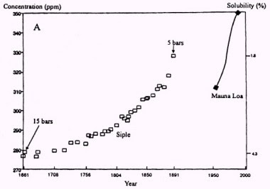
Let's look at the CO2 graph. This graph is based on the IPCC argument that CO2 levels are rising and are at record levels.

Notice anything unusual about this graph? One is the gap from 1900 to 1986. Why is there no data for these years?
Also, the data up until 1950 came from ice core samples taken in the Arctic. From 1986 on, the data comes from direct readings from the 13,000 ft Mauna Loa volcano in Hawaii. That in itself is pretty interesting isn't it? To anyone who's not so eager to just swallow this graph up and accept it as "truth", it leads to the question; Why did they use two different types of data for two different time periods?
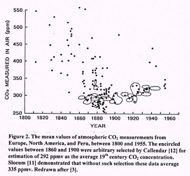
Let's look at another graph.

This is a graph showing CO2 levels up until 1960. The difference between this and the previous one is that this data comes from direct sampling from the Pacific. Notice how the CO2 levels are actually much higher in the 1800's. Also notice how some samples are at around 500 parts per million (ppm). In An Inconvenient Truth, Al Gore specifically states that CO2 levels have never reached above 300 ppm until now.
For a full explanation of these graphs, look at this article.
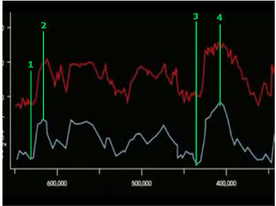
Now let's take a look at the whole Carbon Dioxide - Global Temperature correlation. Here is a frame taken directly from An Inconvenient Truth:

This is from the part of the film where Gore is comparing global levels of CO2 (red) to global temperatures (white). Gore expects you to see this and immediately see the correlation that in general, when CO2 levels are high, so is the temperature. Now keep in mind that this shot is taken right from the movie. I'm going to show you something I'm sure Gore did not intend for you to see.

I drew in some vertical lines. You may have to click on the image to see my point here. Notice how as the lines show, temperatures change first, CO2 levels change later. In line #1, the white line is bottomed out. Notice the CO2 level has not bottomed out at this point. It's following the same general pattern as the temperature but seems to lag behind it. Line #2 is an example where the temperature has peaked, yet the CO2 is still rising. What does this graph show? It shows that temperature increases and decreases affect CO2 levels, not the other way around. In other words, raise the temperature and eventually, the CO2 level will rise. Al Gore and the IPCC want you to believe that changing the CO2 levels change the temperature. Gore's own graph contradicts this claim. I'll concede that not every single peak and valley indicate this, but look at the chart, most of them do.


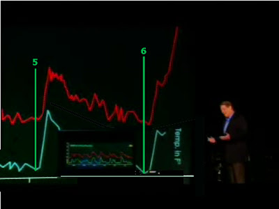
Above is more of the same. This time, we're at the end of the chart (where Gore goes up in a crane to demonstrate the "off the chart" CO2 levels we're going to reach in 50 years or less). Even here, where the temperature and CO2 levels are rising as Gore strongly emphasizes, my point shows again. Look at line 6 where we have the current temperature/CO2 rise, the temperature began rising before the CO2 levels.
Al Gore is lying.
2 comments:
You can make up any chart you want but the fact you are again rejecting science is really stupid.
There are three charts in the article. The first two came from a respected Polish climatologist Zbigniew Jaworowski. I intentionally used his charts because I didn't want to hear the tired argument "He must work for Exxon/Mobil."
The third chart was Al Gore's own chart that he got from the IPCC.
I didn't "make up" these charts. I am not "ignoring science". I have an open mind about this whole thing and have been diligently researching this whole topic. All you are doing is giving empty arguments.
Post a Comment